Nonprofit Branding
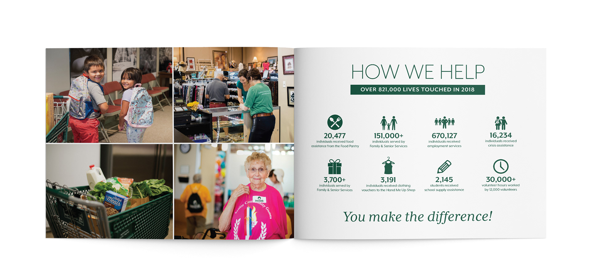
Since 1973, Interfaith of the Woodlands and it's subsidiaries have worked to provide support and resources to neighbors in need. Keeping the original framework of the logo with concentric circles representing unity amid diversity, the logo was modernized in-house and branding elements were uniformly carried out throughout marketing material and reports. Three facilities within the Interfaith umbrella were also given rebrands for consistency with branding, including their childcare center.
SCOPE
Brand Refresh
Brand Guide Creation
Print Collateral
Photography
Annual Report
Brand Refresh
Brand Guide Creation
Print Collateral
Photography
Annual Report